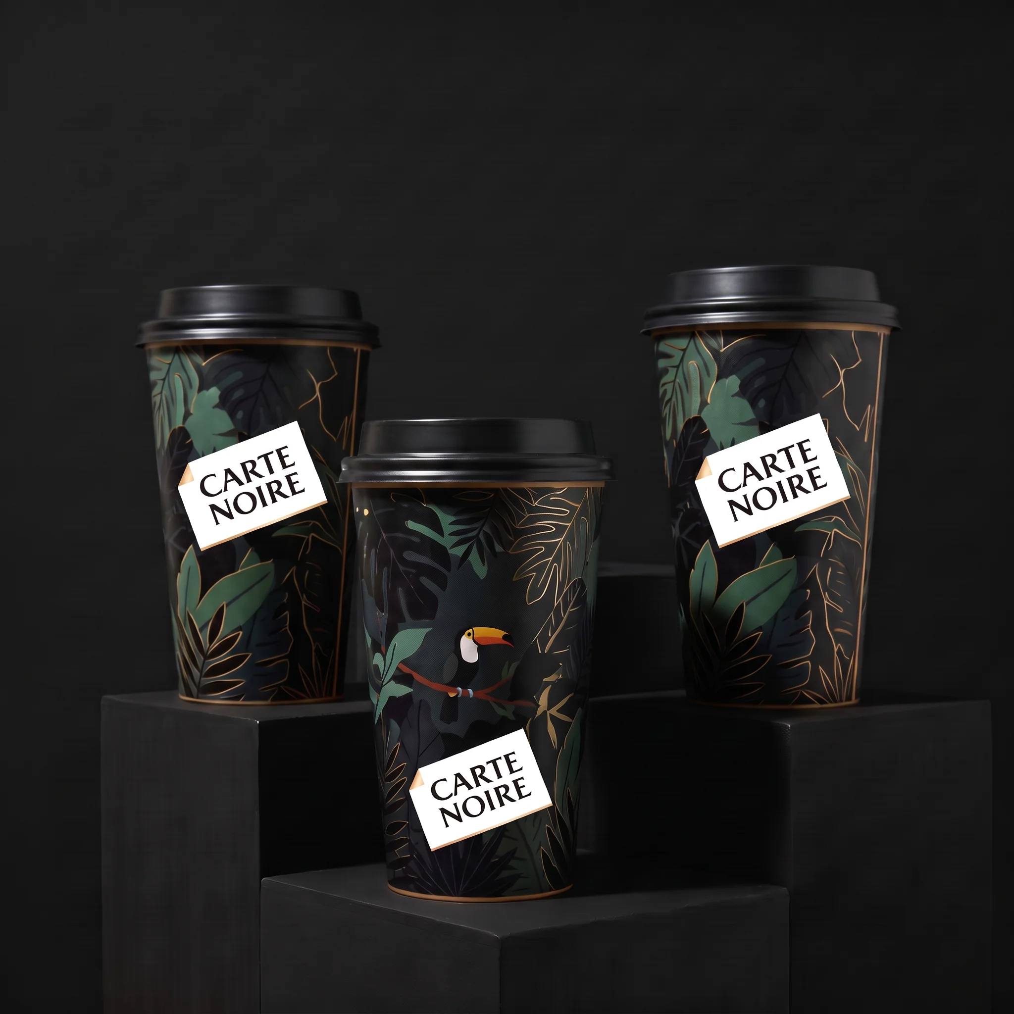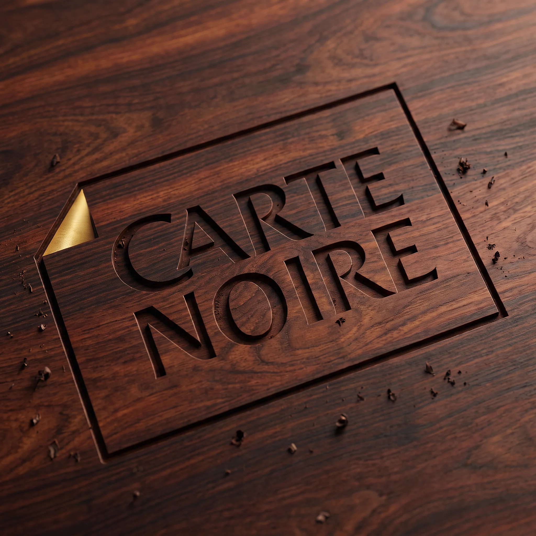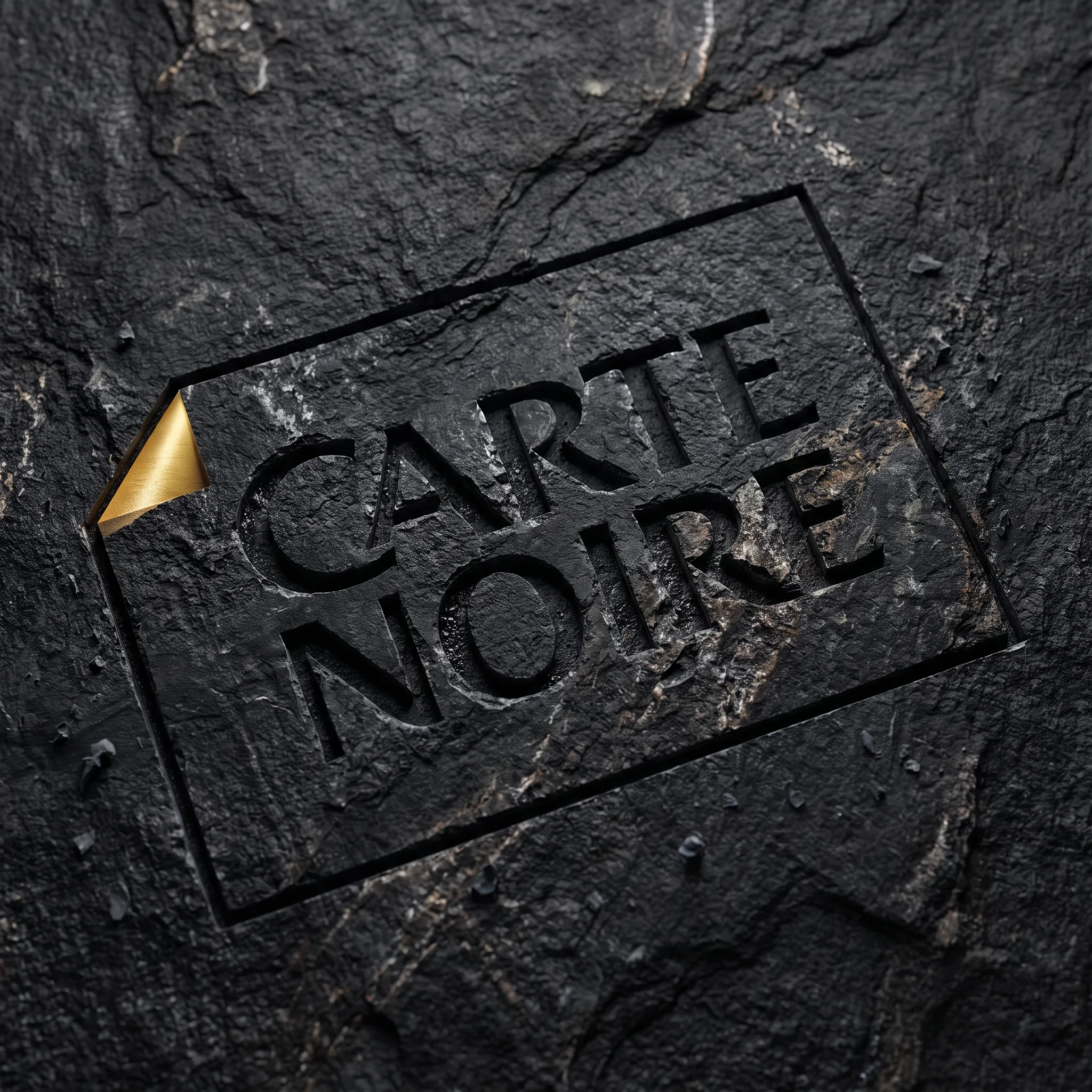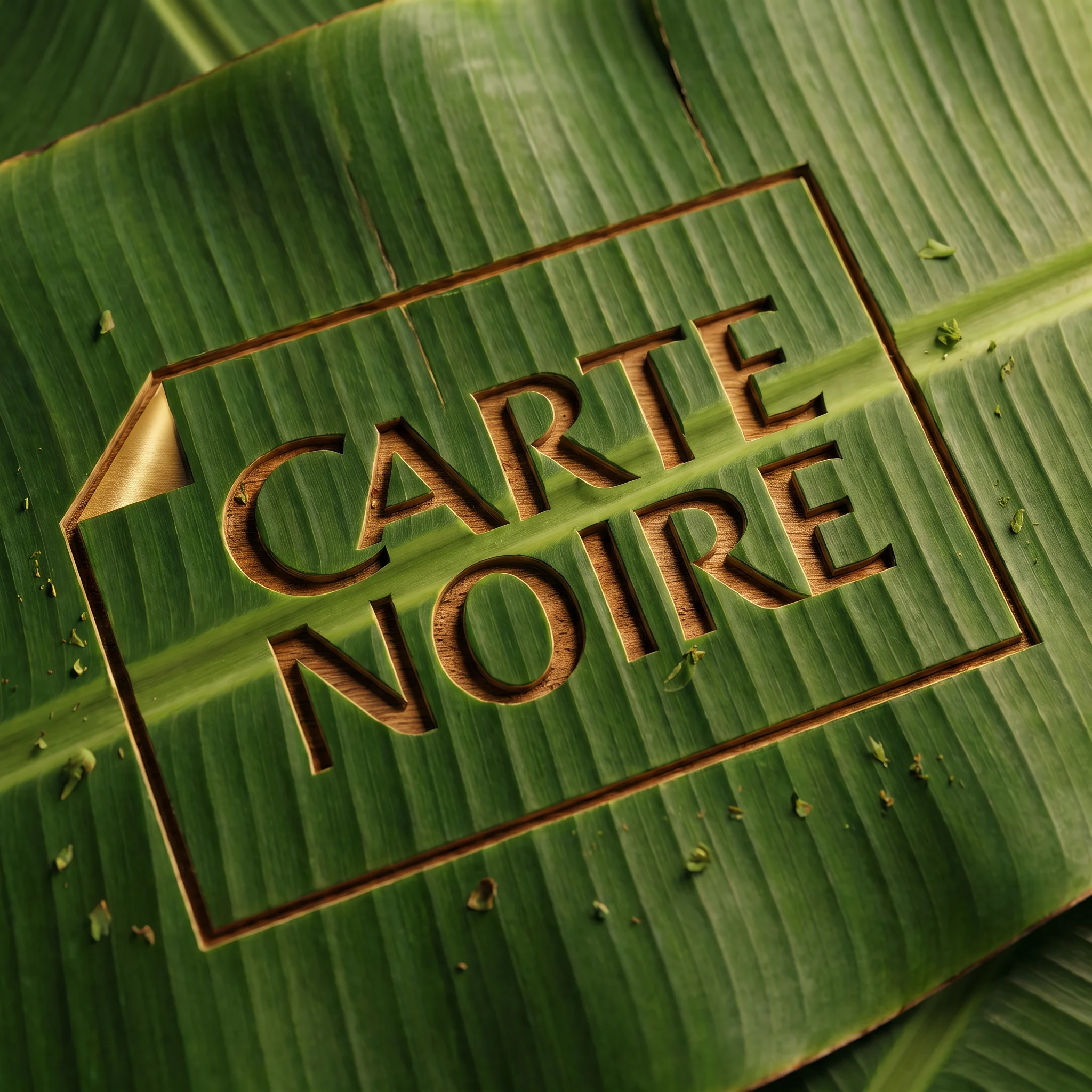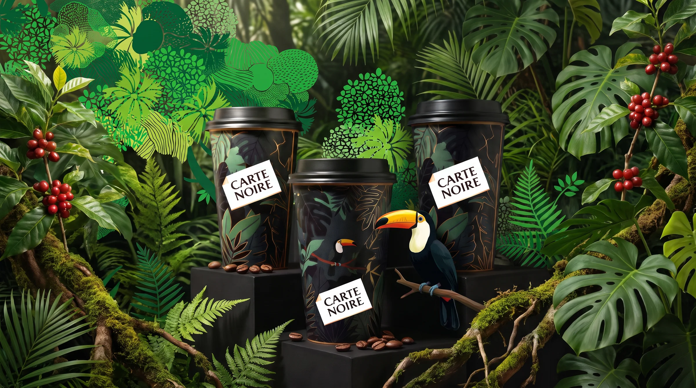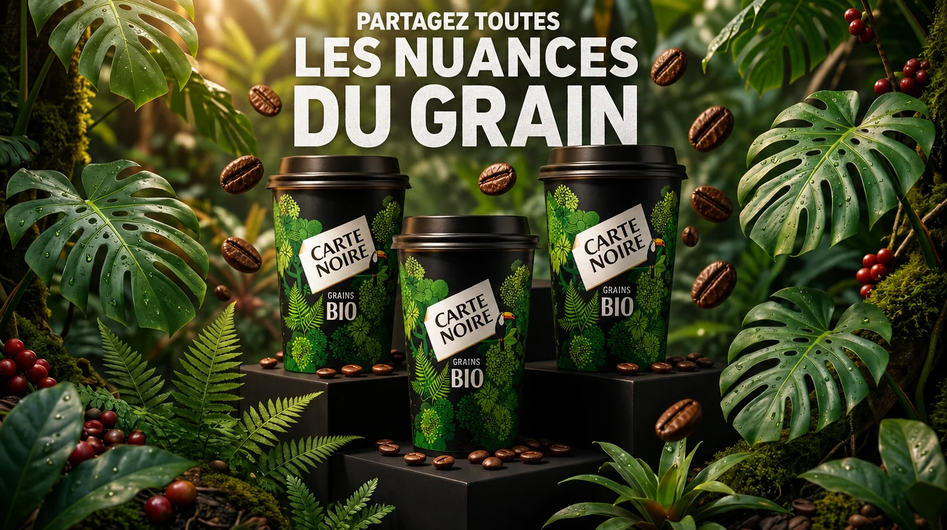
carte noire, hero visual

A crate opens, the aroma spreads.

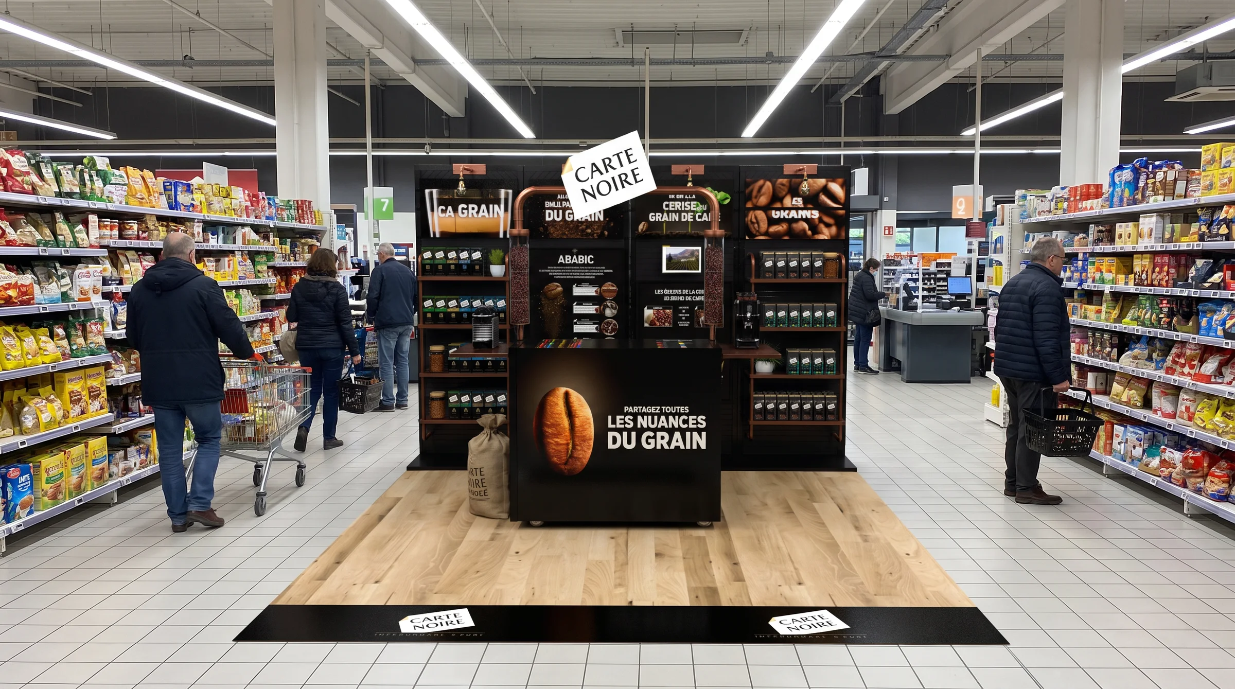
A Carte Noire stand designed like a coffee roaster's shop.

Carte Noire
brand · 3d
carte noire, project visual 01
01 · the challenge

The whole range, a single space

Carte Noire wanted to speak up in supermarkets with something other than an end-of-aisle display. Showcase the whole range, beans, ground, capsules and pods, tell the story of the coffees' origins and the brand's commitments, organic, Rainforest Alliance, 1% for the Planet. And give customers a real coffee experience, from the texture of the bean to the cup, in the middle of the aisle.
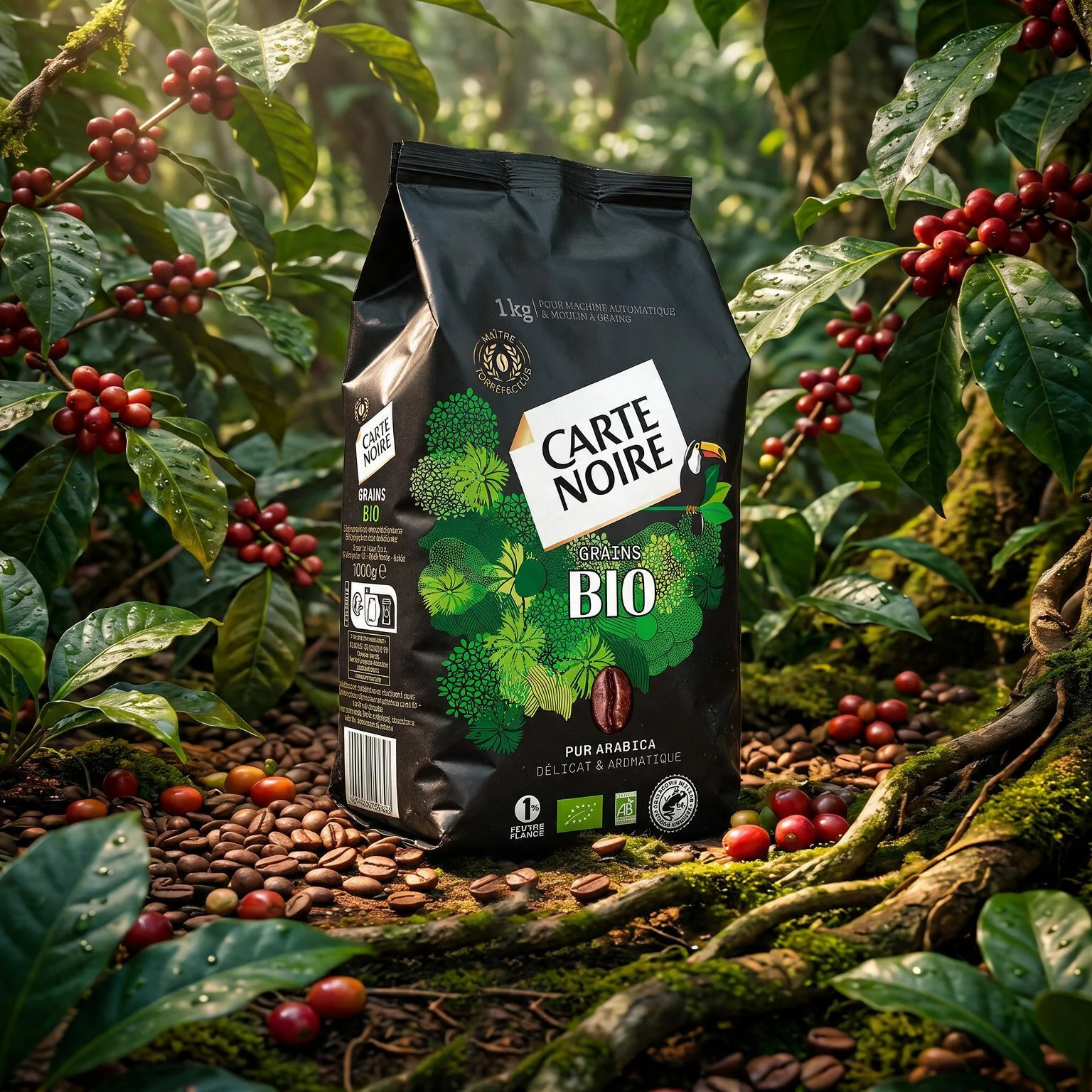
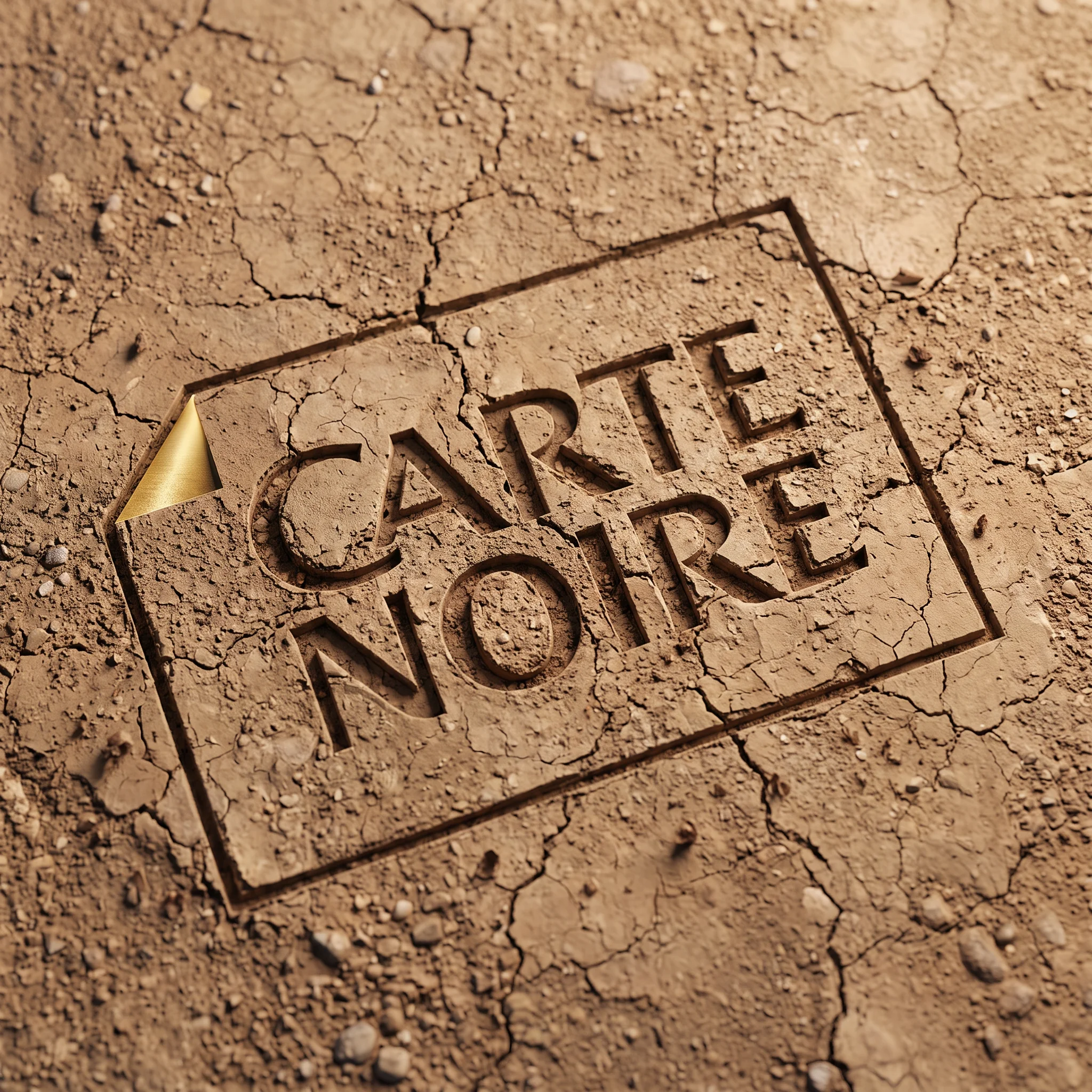
carte noire, gallery visual 09
02 · the angle

The soul of a coffee roaster, in the heart of the aisle

We started from the codes of a coffee roaster's shop rather than those of POS displays: wood, metal, sustainable materials, warm light. Each format has its place, each commitment its panel. The graphics are interchangeable, in classic or organic versions, so teams can adapt the message to the store. A true shop-in-shop, designed to open in any space.

carte noire, project visual 03
03 · the madly signature

Every part in its right place

The constraint was non-negotiable: the entire set-up had to fit into specified transport crates. Furniture, machines, consumables, décor. We designed the structure backwards, from the crate: modular panels, quick assembly, each part sized to the centimetre. Validated in 3D before manufacturing, the stand unfolds and reconfigures to suit the space.

The recap.

We gave Carte Noire a place of its own in the heart of the aisle: a world, a structure, a layout, and a crate to take it anywhere.

4formats: beans, ground, capsules, pods
1transport crate
100%modular in store
1signature world

Produced at madly studio: art direction, product modelling, material lookdev, lighting, rendering.

Want a similar project?

Let's talk over coffee.

An email, a meeting, a real conversation. Madrid or Lyon, your call.

Écrire à l'équipe